Advanced Product OptionsUsing the app
Managing Wide Image Card option
This new Wide Image Card option type gives you more flexibility in designing visually appealing option layouts, with support for links, customizable buttons, and full design control.
1. Advanced Value Settings
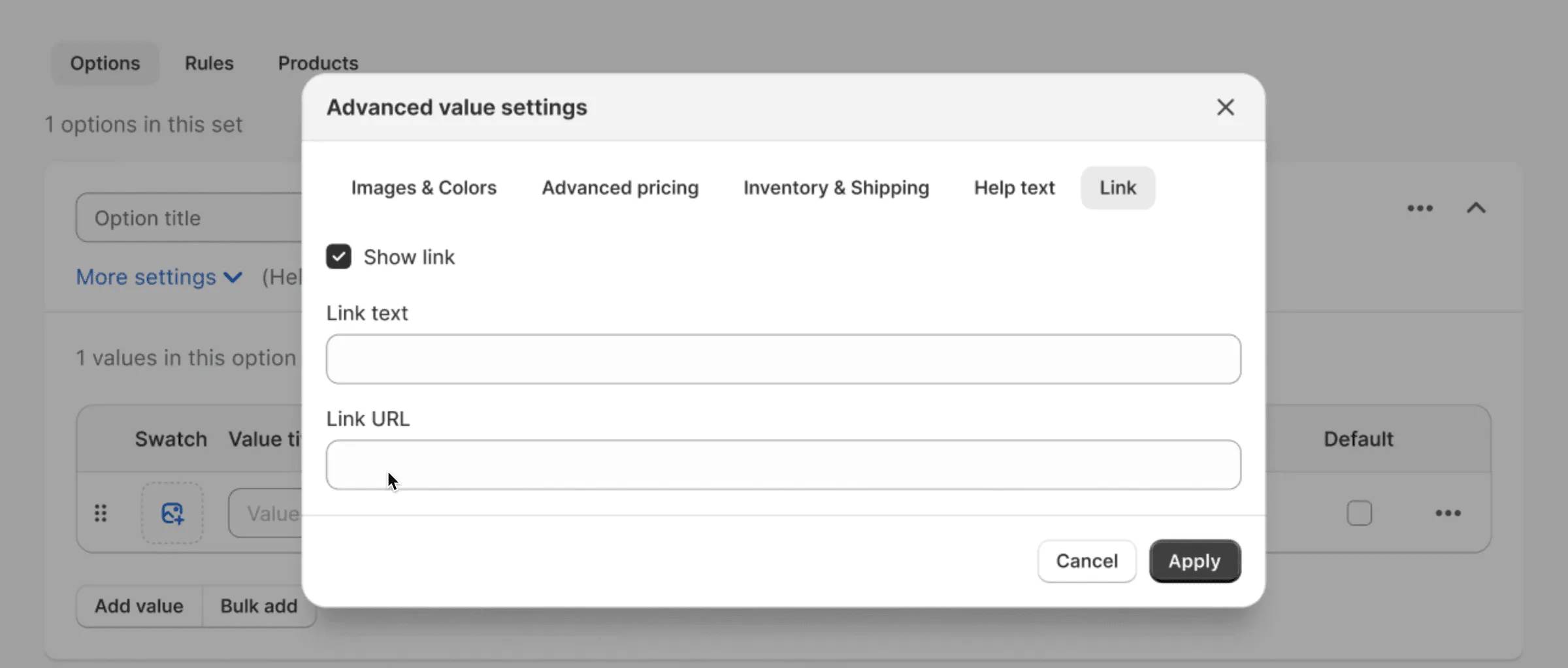
Section titled “1. Advanced Value Settings”In Advanced Value Settings, a new Link tab is available specifically for Wide Image Card values.
- Show link (checkbox)
- Link text – the text to display for the link.
- Link URL – the address the link points to.
If the checkbox is enabled, a link will appear below the help text inside the card, using the provided text and URL. The link will be opened in a new tab.
2. Edit Elements Modal
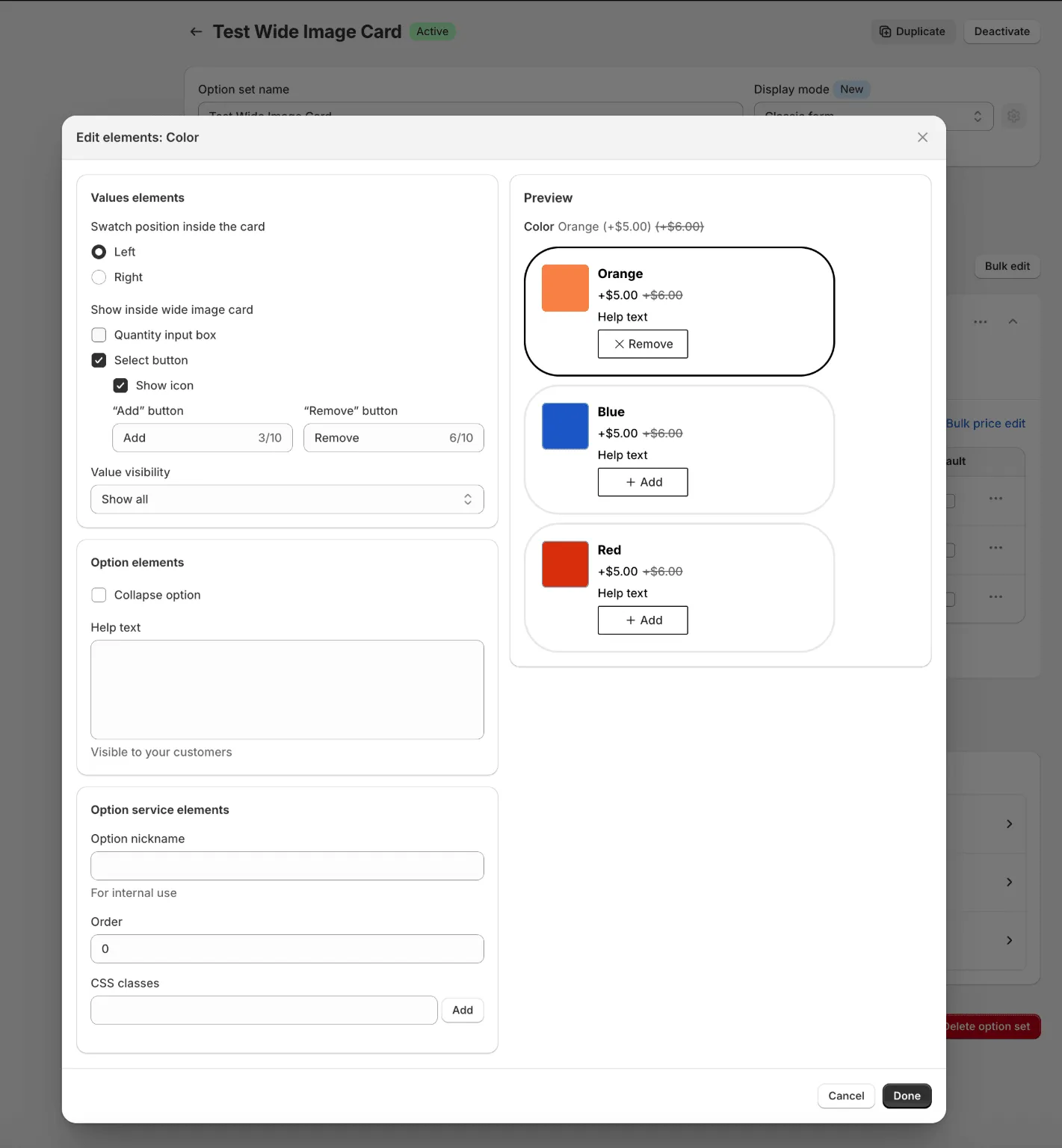
Section titled “2. Edit Elements Modal”In the Edit Elements modal for Wide Image Cards, the following settings are available:
Value Elements
Section titled “Value Elements”-
Swatch position inside the card – Left / Right
-
Show inside wide image card:
-
Select button
-
Enables Add/Remove buttons on the card.
-
Text for each button can be customized:
- Add button text (default: “Choose”)
- Remove button text (default: “Remove”)
-
-
Quantity input box – enables the quantity input field inside the card.
-
Value visibility – options to choose how values display:
- Show all
- Carousel
- Show first, click for all
-
-
Multi-select Wide Image Card (additional setting):
- Limit number of values for selection – Min/Max input fields
Option Elements
Section titled “Option Elements”- Collapse option
- Help text
Option Service Elements
Section titled “Option Service Elements”- Option nickname
- Order
- CSS classes
3. Design Customizer Settings
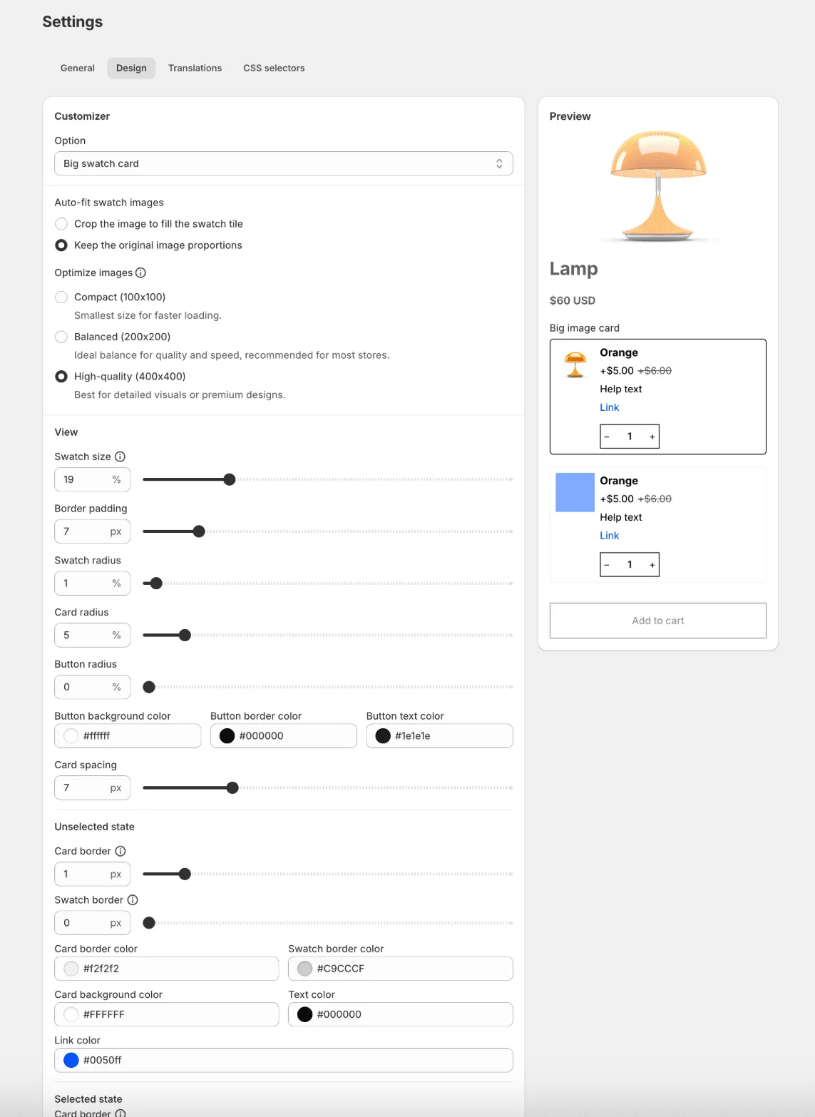
Section titled “3. Design Customizer Settings”In App Settings → Design → Customizer, an “Option” dropdown is available with two values:
- Swatch
- Wide Image Card
When selecting Wide Image Card, you can configure design settings and see a live preview with default values.
Available settings:
General
- Auto-fit swatch images
- Optimize images
View
- Swatch size
- Border padding
- Swatch radius
- Card radius
- Button radius
- Button background color
- Button border color
- Button text color
- Card spacing
Unselected State
- Card border
- Swatch border
- Card border color
- Swatch border color
- Card background color
- Text color
- Link color
Selected State
- Card border
- Swatch border
- Card border color
- Swatch border color
- Card background color
- Text color
- Link color