Advanced Product OptionsUsing the app
Design
Crop Image
Section titled “Crop Image”Our app includes a swatch image crop feature that allows you to precisely control how images are displayed as swatches. With this feature, you can crop images to ensure they fit perfectly within the swatch dimensions, providing a clean and consistent look for product options. This helps improve the visual appeal and usability of your swatches by removing unnecessary parts of the image, making sure each swatch is clear and easy to identify.
To crop the image:
- Go to the “Images & Colors” tab
- Click the “Crop” icon below the image
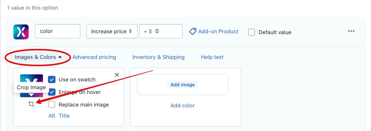
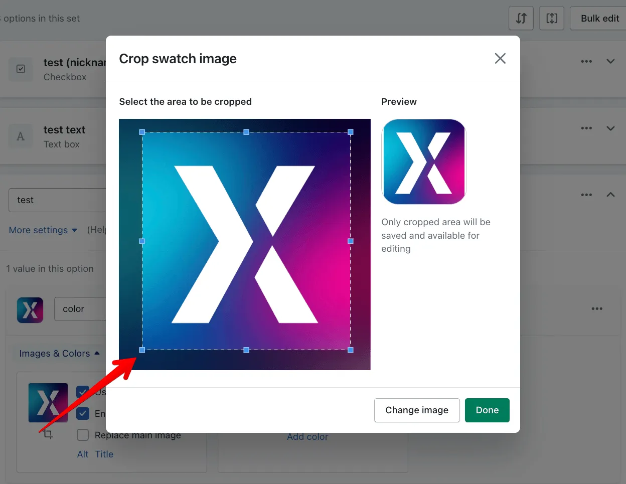
- Adjust the size of the image uploaded in the popup
Swatch customizer
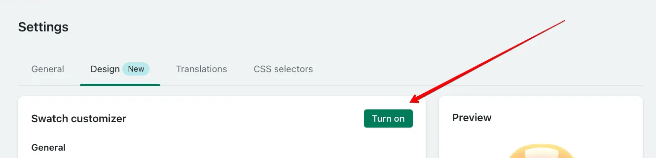
Section titled “Swatch customizer”The “Swatch Customizer” functionality is available in the “Design” tab of the app’s Settings section.
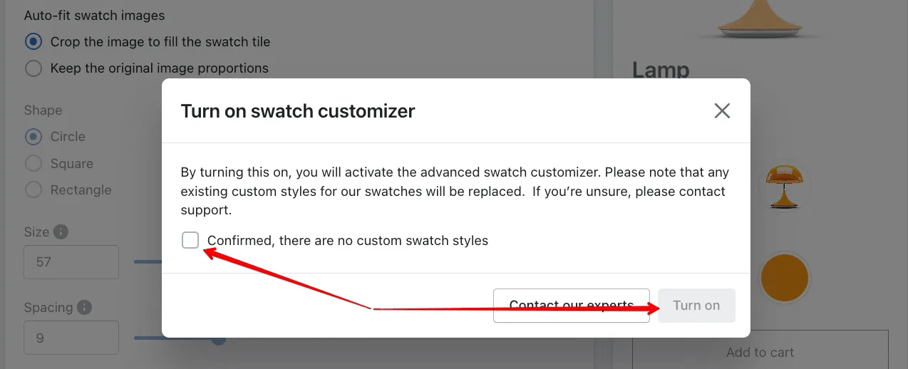
To enjoy the enhanced swatch customization settings, you need to turn the “Swatch customizer” option on. Please note that enabling this feature will reset all the custom styles added to swatches earlier (if any), and you won’t be able to revert it, so you’ll need to confirm the upgrade:
Design version:
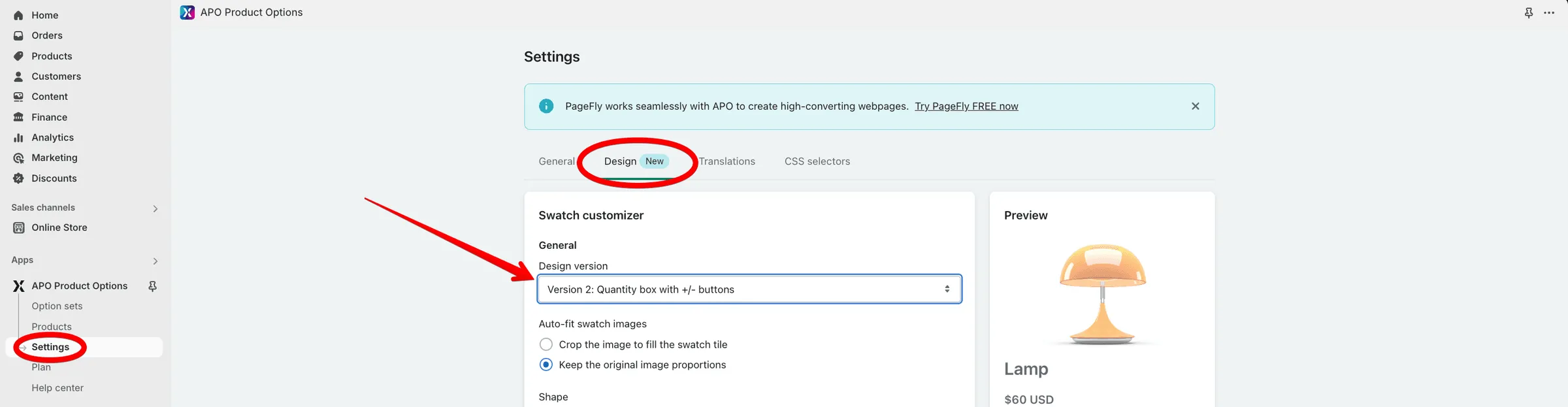
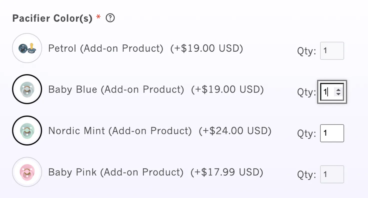
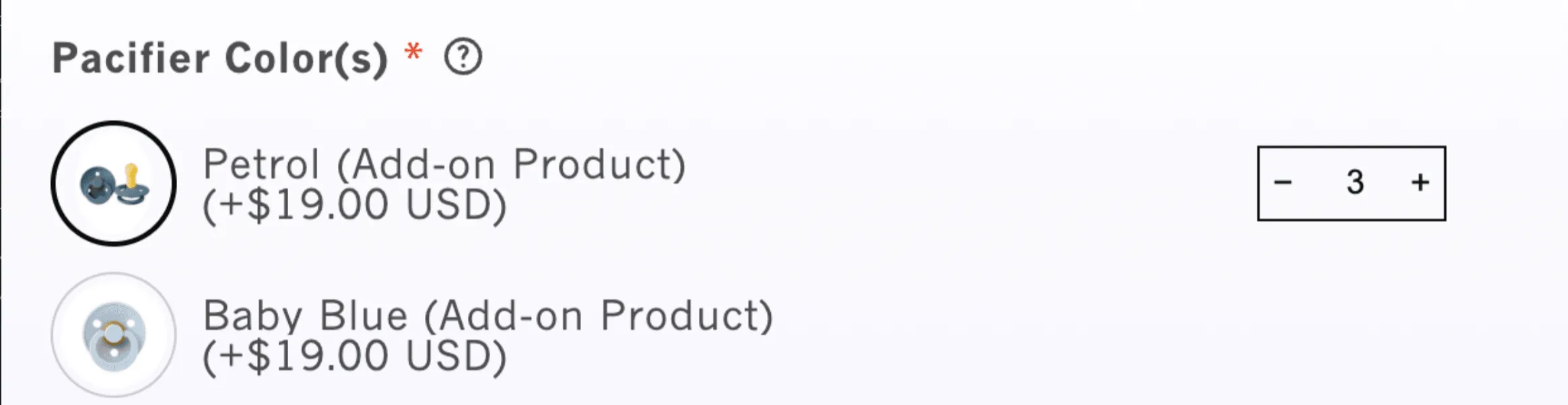
Section titled “Design version:”You can switch from the regular QTY boxes that offer manual input only to the upgraded ones with the +/- buttons. To do that, you need to enable the “Version 2” design version:
Auto-fit swatch images
Section titled “Auto-fit swatch images”You can decide whether you’d like to crop the uploaded images automatically to fit the swatch tile, or keep the original images.
You can select between the 3 default swatch icon shapes and manage their dimensions:
- Circle
The circle swatch shape offers a clean and modern look, making your product options visually distinctive. - Square
The square swatch shape offers a clean, structured appearance that fits well with a variety of product types. Its defined edges make it ideal for displaying detailed images, patterns, or text. Square swatches provide maximum space within a small area, making them a practical choice for stores with multiple product variations. - Rectangle
The rectangle swatch shape gives you more flexibility to showcase images or text on your swatches, particularly when longer product names or details are involved. It also helps visually differentiate your product options, adding a unique touch to your store’s design.
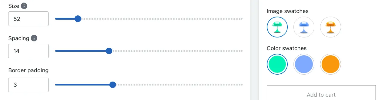
Quickly adjust the swatch size by moving the slider. The allowed sizes vary between 10-400 px.
Spacing
Section titled “Spacing”Add as much space between the swatches as you need. The allowed spacing is 0-50 px.
Border padding
Section titled “Border padding”Border padding in swatches refers to the space between the edge of the swatch (the border) and the content inside the swatch, such as images or color samples. This padding affects the visual layout and overall appearance of the swatches.
Unselected state
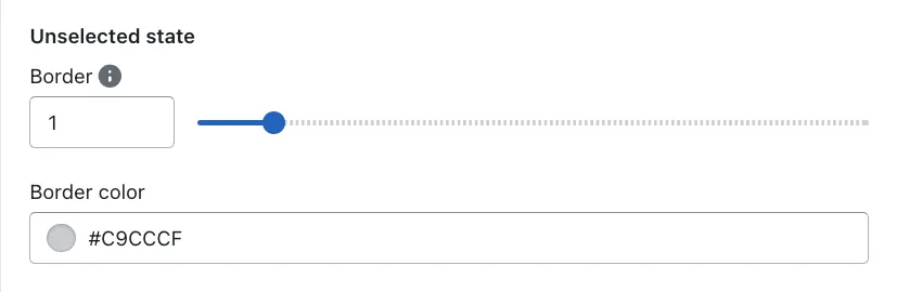
Section titled “Unselected state”Decide on the border size and color when swatches are unselected:
Selected state
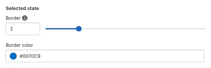
Section titled “Selected state”Here, you can select the preferable border size and color for the swatch value that is selected to make it stand out: