
The majority of eCommerce store owners spend most of their time either on optimizing the homepage or on creating well-organized and brushed-up product pages.
While the above-mentioned pages are surely important, there’s another page type, the potential of which is often ignored and overlooked by online merchants.
I’m talking about category pages.
Basically, these are individual website pages that structure website taxonomy. In online stores, categories and sub-categories are normally used to classify products or services by grouping them together in one place.
Category pages help in improving store navigation, usability and internal search mechanisms, which all results in enhancing the overall customers’ shopping experience. What is more, while playing the role of a transit point, a category page can be optimized to solidify visitors’ purchase intent and convert them into buyers.
From this article, you will learn how to avoid the most common mistakes while creating pages of this type. Also, we’ll tell you how to improve the efficiency of your existing site categories and subcategories.
Table of Contents
Category Page Content
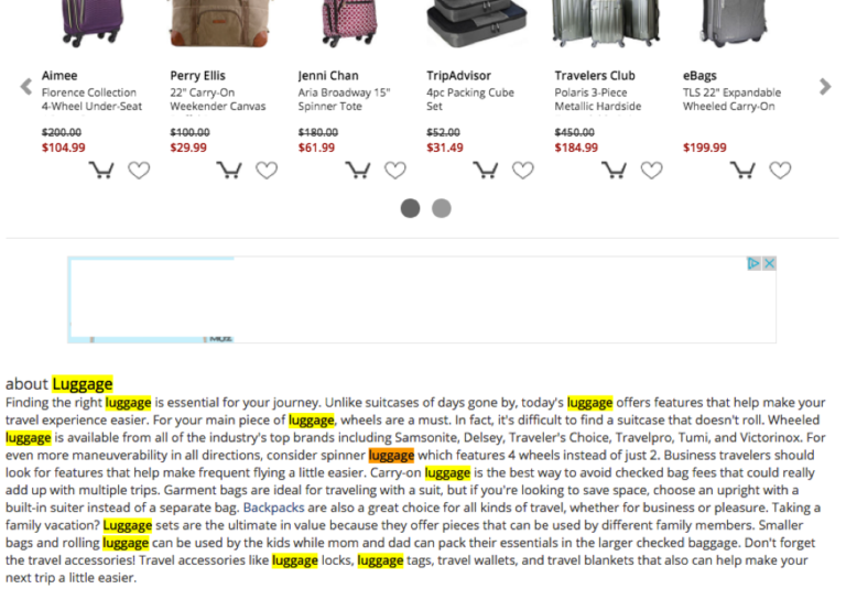
The ugly truth is that most of eCommerce category pages are short on content. In the majority of cases, there’s only a list of products and a tiny amount of content (that is usually taken from the actual product pages).
Meanwhile, injecting some useful and unique content in there can make these page rank better and bring you an extra portion of targeted traffic.
Also, being optimized, category pages will let you tell your store visitors more about your product and brand, answer frequently asked questions, and usher them through the conversion funnel.
 Content Types
It’s generally believed that maximum what can be added on category pages is an extended description.
However, a big number of eCommerce websites proved that you can successfully use practically any type of content there.
So category pages can come with:
- a detailed description of category products,
- eye-candy hero images,
- engaging image sliders,
- banners that announce global store sales or specials,
- sections with featured products and services,
- a ‘New Arrivals’ section,
- videos that tell how to select the most suitable category product or how to use it the right way,
- use cases,
- case studies,
- an ‘Expert Advice’ section,
- FAQ,
- and even storytelling.
Below is a couple of examples that tell how to use the abovementioned content types on category pages.
On the main category, Urban Outfitters uses eye-candy imagery to introduce different brands and types of clothes. Image is clickable.
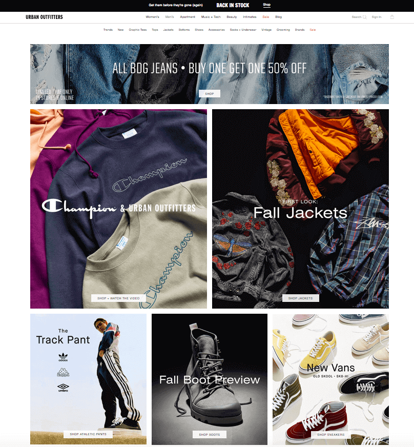
Also, down this page, they have ‘New Arrivals’ and ‘Now on Sale’ sections.
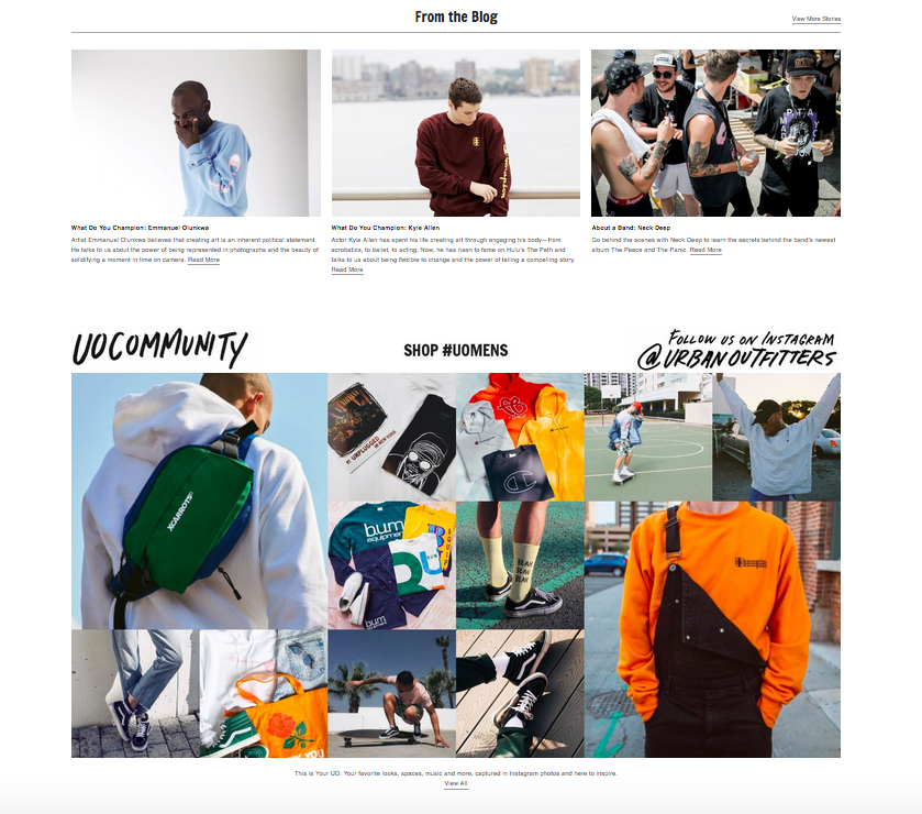
But the most interesting thing is at the very bottom of the page. There, there’s a section with relevant blog articles and user-generated content — a feed of Instagram posts with the company’s branded hashtag.
Thus, the brand is creating somewhat that unites all its customers — a dedicated community of its fans. In the community, everyone can share their own story and get feedback from like-minded people.
If you drill down to the subcategory level, you’ll see a great example of video content usage.
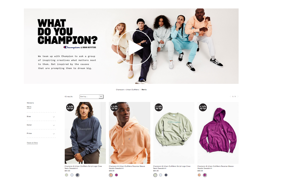
In the videos, Urban Outfitters interviews their regular customers and asks them for an opinion about a certain brand.
By adding all this extra content, Urban Outfitters aims at engaging with site visitors and customers, educating them and providing with all possible information about the chosen group of products.
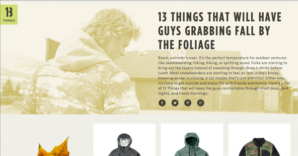
Another great example of using the content on category pages comes from 13 Things.
These guys managed to successfully use storytelling right on the category pages. Their stories natively blend with the category page layout, even despite being placed at the top of it.
Content Placement
The biggest challenge you may face when adding content on category pages is finding the right spot for it.
On the one hand, putting too much content above the product grid may push category products down the page. That may confuse shoppers and lower this page conversion rates. On the other, if you add content at the bottom of such a page, no one is ever going to find it.
Truth be told, there’s no universal recipe for finding an ideal place for content on a category page.
The placement depends on a page layout and the type of content you’d like to add. Below, are some examples.
Bright hero shots are better to display at the top of this page. Same is with image sliders and banners with special offers. (clickable)
 As for featured products and brands, your mobile app ads, they can be placed either at the top or in the middle of your category page. There’ they don’t switch visitors’ attention from the main content and add extra valuable details to it.
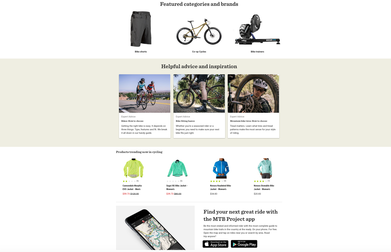
Product use cases, expert advice, and FAQ sections look better in the middle or at the bottom of this page.
If you are going to add a detailed text description of a certain product group (with SEO in mind), it’s generally advised to add it at the bottom of a category page, in order not to distract attention from the products you are selling.
This is how we did it on the MageWorx website (clickable).
Content quality
Whatever content you may create for your website, quality is always the key factor. Content for category pages is not an exception.
Even if you are going to write a generic description for your category, bear in mind that you’re creating content for humans, not a filter copy for the search engines.
Below are the good and bad examples of a category page description.
Bad
“You are in the [CATEGORYNAME] category! Here you you can find [CATEGORYTAGS] and other great [CATEGORY_NAME] products.”
Good
[STORENAME] offers a wide range of [PRODUCTNAME], ranging from entry-level options under $50 (e.g. [BRANDNAME], [BRANDNAME]) to cutting-edge, advanced solutions starting from $500 and designed by [BRANDNAME], [BRANDNAME].
With such an extensive choice, choosing the right option can be a daunting task. That’s why we’ve created a [PRODUCTNAME] buying guide (link) that describes all the trending solutions, their features and pricing.
Don’t just waste space on your category page by adding useless content there.
Instead of a cloud of a keyword staffed texts for the search engine bots:
add something that your customers can really appreciate.
Nosto, for instance, uses the area below the list of their services to promote their eBook: (clickable)
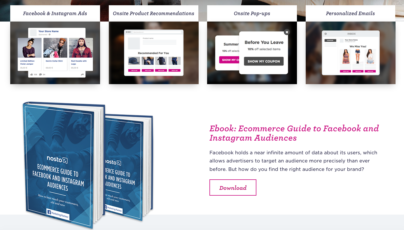
By doing so, they are killing two birds with one stone. First, they educate site visitors, help them better understand their services. Second, they capture emails of prospective customers.
So whatever content you may add to your store category pages, make sure it brings value to your visitors and customers.
Optimizing Images
When visiting brick-and-mortar stores, you may have noticed that they actively use signs and banners that hang around different departments. These visual aids help to drag customers attention to something important or inform them about their current location.
Images on eCommerce category pages play a similar role.
Category graphics can be effectively used to:
- tell customers where they are,
- inform site visitors about discounts, specials or loyalty program benefits,
- update customers on your product offerings (new arrivals, featured products, etc.),
- add extra polish and professionalism to your site.
Thus, images on category pages can improve the overall site navigation and multiply their conversion rates.
However, if used the wrong way, category graphics can completely ruin your customers’ shopping experience. Below are the things to take into account when adding visuals on eCommerce category pages.
Don’t use hero shots that take up the entire 1st screen
As said above, images on category pages should improve navigation and help customers understand where they are.
Using too big hero shots pushes the main category page content down, so site visitors may get confused (especially on their mobile). Large images push down the main content, so it’s unclear what such a page offers.
Ideally, category hero images should cover not more than 2/3 of the 1st screen both on mobile and desktop devices (so that at least some products could be visible on the 1st screen) and vividly illustrate what a category below is about.
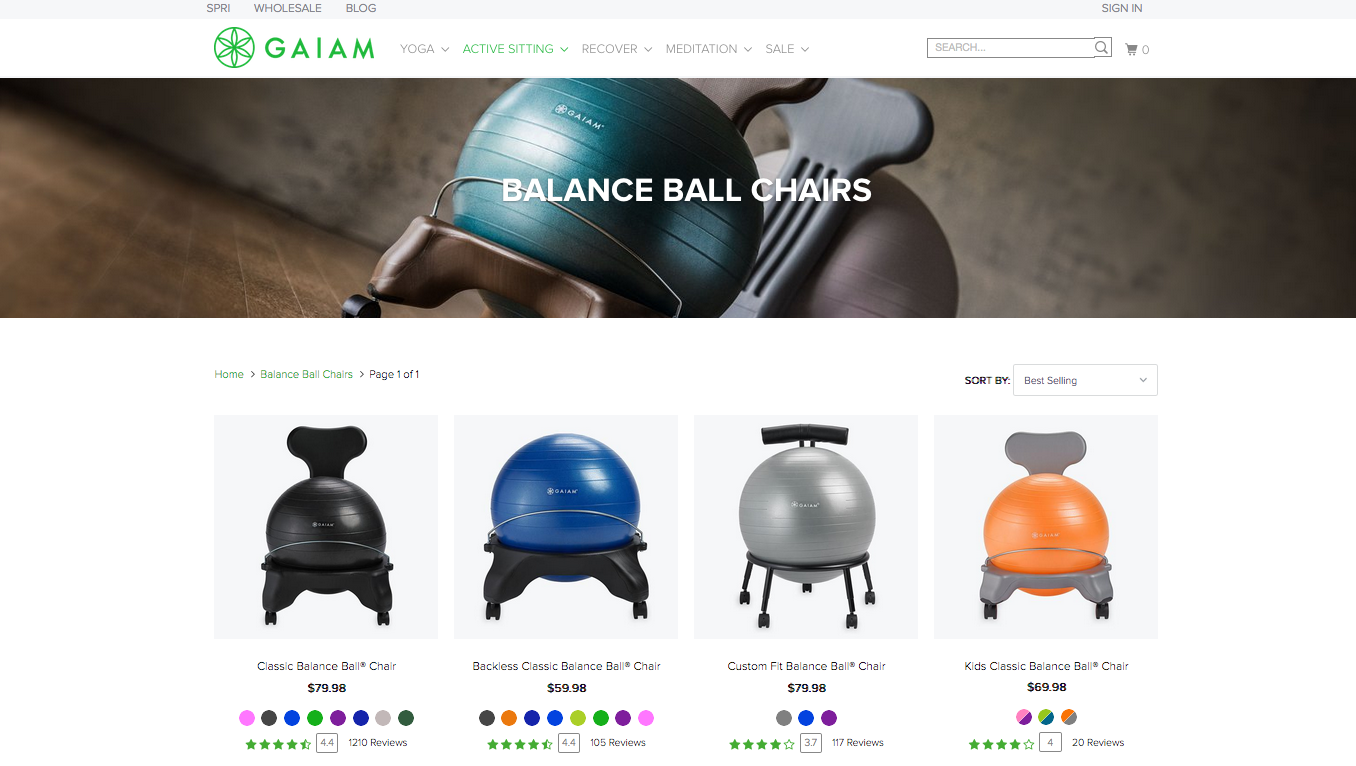
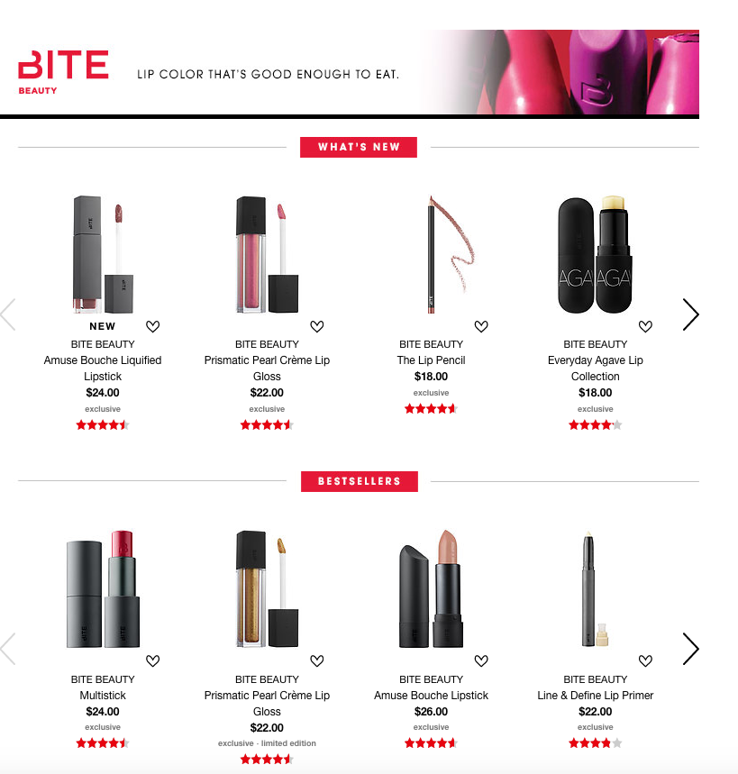
Gaiam and Sephora are good examples of using hero images on category pages. The former clearly shows what a customer finds down the page. The latter lets immediately understand that this is a page of certain cosmetics brand – they display the brand’s logo, motto and the company’s main products right above the products feed.
Images are clickable.
Be consistent with the images you use for categories
Psychologically, a category page is perceived be a site visitor as a perceptual unit. Hence, when it comes to filling it with imagery, such factors as consistency, cleanliness and organization become crucially important.
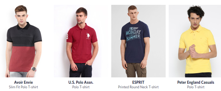
Just compare this example:
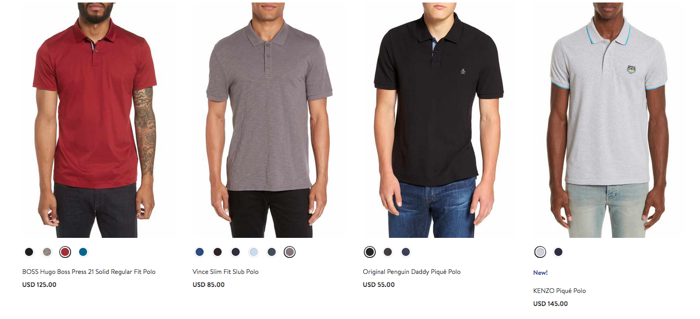
with this one:
In the former case, we see images with different male models who are striking different poses. They are wearing T-shorts of different brands, fits, neck styles and graphic types. Looks like those photos were made in different times, in different surroundings. All that makes this category page look quite inconsistent.
In the latter example, on the contrary, we can see a well-organized, consistent range of products of the same fit and neck style, all put on a homogeneous background. Such an approach definitely improves the look-and-feel of an eCommerce category page and eases perception of its visual content.
Although the latter case is not somewhat all eCommerce stores should obligatory implement (as some stores may have unique designs, page layouts, etc.), it’s definitely a good example to follow.
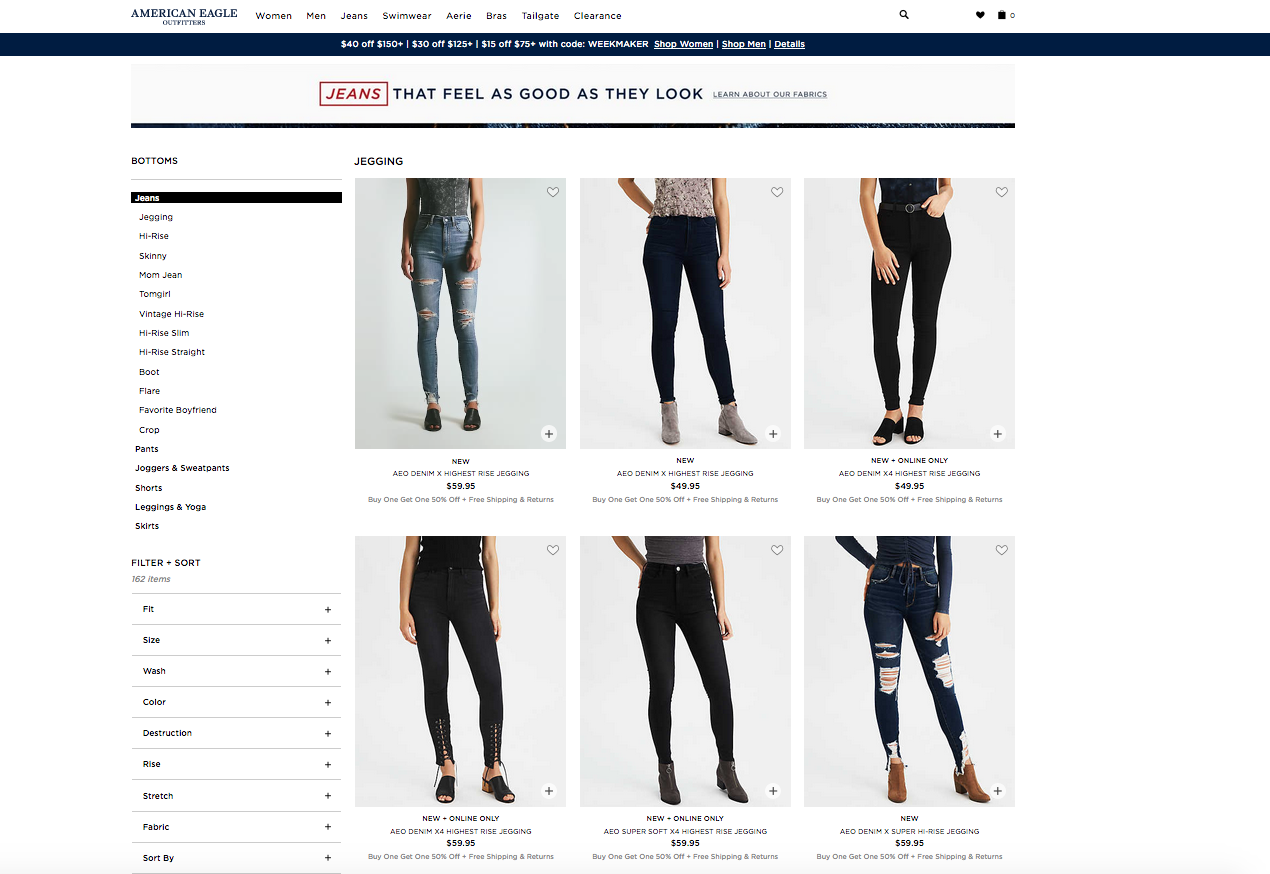
Use .Gif / Video Previews
You’ve probably heard of (or may be already using) a zoom out product image preview. This feature allows customers to take a closer look at a chosen product by adjusting its image size.
Video or . Gif preview lets you further extend this functionality and display any product in action. What is more, this way, you can display any product from various angles.
Product video previews can be displayed upon mouse-over, right in the product catalog. Here is how American Eagle implemented that:
Bottom Line
By adding the right content and imagery to your site categories, you’ll help your visitors get a clear idea of what you are selling and what they can get on your website. Plus they might find some products they were not aware of before.
In the next article, we’ll tell you how to optimize store categories in terms of SEO and mobile.
Check out for updates on our blog — “Optimizing Category Pages for SEO and Mobile” article is coming next week.


