
Ok, the truth is — most of online shoppers skip banner ads. They tweak their browser settings to hide this type of antiquated ad medium once and for all.
However, despite quite a bad reputation and comparatively low click-through rate (CTR), ad banners still remain a very effective tool for enhancing brand awareness and reaching a wide audience. All that at a relatively low cost.
Want to know why?
The benefits of using online display advertising for an online merchant are:
- a wide selection of ad targeting opportunities — one can choose from contextual, placement, interest, geo, and targeting options
- cost — this type of ads is a lot cheaper than CPC ads, plus the competition in this niche is not that tough
- a wide spectrum of retargeting options — banner ads can be displayed to those who have already visited your website
- the ability to reinforce a brand message
- the ability to trigger brand interactions — by using animation, java scripts, or flash technologies, one can initiate interaction with a banner, thus luring a potential customer to proceed to a website
- accountability — a website owner can easily measure the effectiveness of online display ad campaign and adjust it for a better effect.
Also, I can’t help but notice that banner ads are getting more and more creative — they stand out on any webpage, immediately spark interest and result in a click. In addition to image and text, they may include advanced graphics, animation, and even audio and video. All these media elements help online merchants better communicate their marketing message and easier capture the attention of site visitors.
In this post, I’m going to share my thoughts on the trends that circulate in the banner ad design field.
Also, I’ve collected some outstanding desktop banner ads I’ve run into on the Web lately.
So, let’s roll in.
Table of Contents
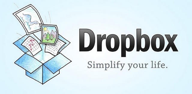
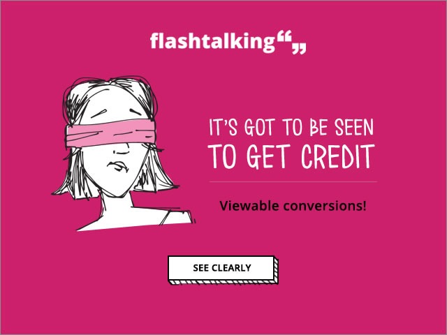
1. Hand-Drawn Illustrations
We all love hand-made stuff. That’s the reason why sketchy, manually drawn images and illustrations are getting so popular in Web-Design. Have a look at these cute examples by Dropbox and Flashtalking.
Basically, these ads have nothing but just a simply drawn illustration, a short message and a call to action. Yet, these whimsical images stand out on a page and easily attract visitors’ attention.
By the way, the websites created in such a style also look super cool.
Our design team has recently won a prestigious RuNet award for the design they created in a hand-drawn manner.
 2. Flat 2.0 or Material Design
A little-know fact: Flat Design was first introduced in Microsoft’s Zune MP3 player. However, it didn’t become really popular until 2013, when Apple released its iOS 7. Next, in 2015, Google updated the whole Flat Design concept by introducing Material Design language, that is also referred to by some designers as Flat 2.0.
Now, this type of design has become more vibrant, got lights and shadow, color depths, and even motion. Also, Flat 2.0 is characterized by edge-to-edge imagery, the choice of bright contrasting colors, and large-scale typography.
Ad banners created in this style look minimalistic yet quite informative and eye-catching.

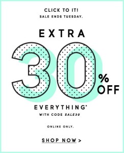
3. The New Retro
Yes, everything old is new again.
Getting back to retro style started as a trend in logo design in 2014, and now it has spread to every other field of Web design, including banner ads.
When we are talking about reviving the retro style in Web-design, we don’t refer to any particular time period. Today’s designs can be inspired either by the simplified, hand-drawn illustrations from the early 30s, or bright, cheerful images and polka-dotted backgrounds from the late 50s.
Pixel art, bold, playful typography, geometric designs, and patterns get mixed with modern images, thus creating mind-blowing images that can’t stay unnoticed.
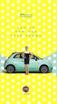
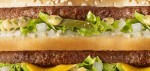
4. Oversimplification
Sometimes to burst your way through the crowd, all you need is to deliver a clear, straightforward message.
A surprising fact is that you can do that ALL just by displaying your company logo, slogan, or a close-up picture of a product.
Look at the great examples by Volkswagen and Macdonald’s:
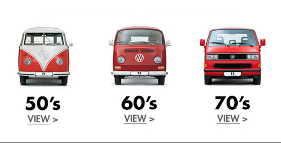
The only thing you should note is that this type of banners should anyway look… like banners. Site visitors may put them down for ordinary non-clickable images, partners logos, etc.
To attract customers’ attention to such types of banners, you may add frames, shadows, overlays, contrasting backgrounds, and sometimes even buttons.
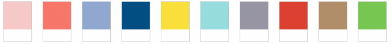
5. Bright Pastel Colors and Bold Typography
According to the PANTONE Fashion Color Report Spring’16: “Colors this season transport us to a happier, sunnier place where we feel free to express a wittier version of our real selves.”
Bright pastels, strong shapes, and lines, and unexpected color combinations are popular with Web designers this season.
This is the color palette that is trending in Webdesign at the moment:
 As for banner ad fonts, this year, we can observe a comeback of big, irregularly shaped fonts, capitalization, bald, and italics. Also, as mentioned above, hand-written stuff is also getting on the trend.
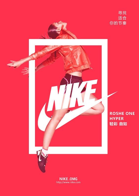
6. Interactive Banners, Story Telling, Relevant References
Over the last years, online advertising has been moving toward interactive ads of all shapes and sizes. Banner ads are not an exception.
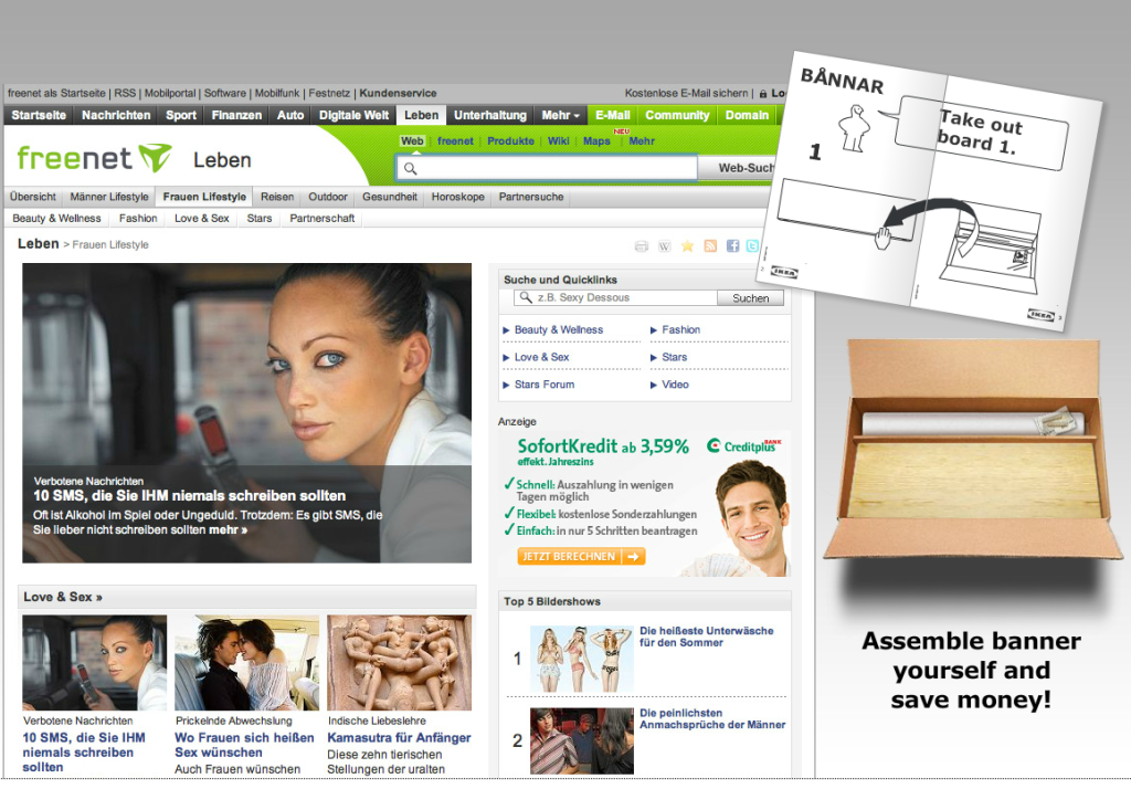
This is an example of such a media-rich banner ad created by IKEA. They used their famous instruction manual to assemble a banner!
Follow this link to try to do it on your own.
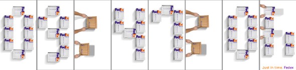
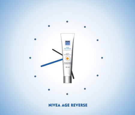
Storytelling is also an effective means to attract more attention to your banner ad. Look at this brilliant example by Fedex and Nivea:
And this the banner with a story that we created for our Magento SEO Config Service. 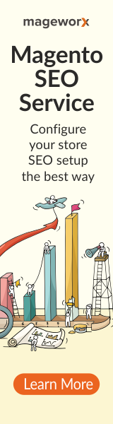
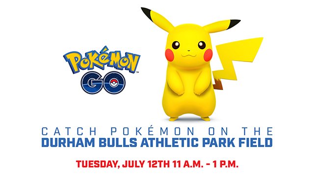
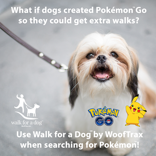
And finally, you can use famous Internet memes, make a reference to some trending events, pop-culture phenomena, etc. All the contemporary, trending stuff works great to capture reader’s attention.
For example, since everyone and their mother are playing Pokemon Go these days, why not capitalize on it?
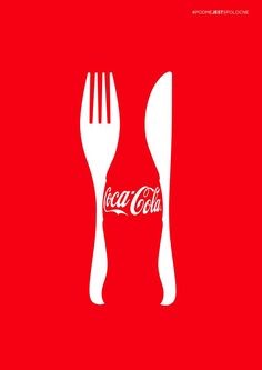
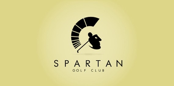
7. Negative Space
Together with material design and minimalism, negative space is also widely used in banner ads today.
Although it’s not a new trend, but it’s picking back up this year.
Basically, a negative space design delivers a “subliminal message” by using a free space of the ad banner and incorporating it into a company logo.
Here are the examples of Coca-Cola and Spartan Golf Club:
Bottom-Line
So, as you can see, online display advertising is not dead, and it is here to stay.
But as I said at the very beginning, banner ads are evolving. Today, they are following the latest design trends, incorporating various media elements, and developing a whole new way to communicate with site visitors.
So to make the most out of them, you should apply your creativity, and make them original and unique.
P.S. If you have other info about banner ad design trends, just leave us a comment!


